
The six phases of data analysis aren’t just for analysts in lab coats or tech wizards in Silicon Valley—they’re for you. Whether you’re managing a business, optimizing your side hustle, or just trying to stop blowing your budget on takeout, this process is your cheat code for solving problems and making better decisions.
Data is your map, and this six-step journey is how you find the treasure. So, let’s break it down—simple, fun, and with tools you can actually use.
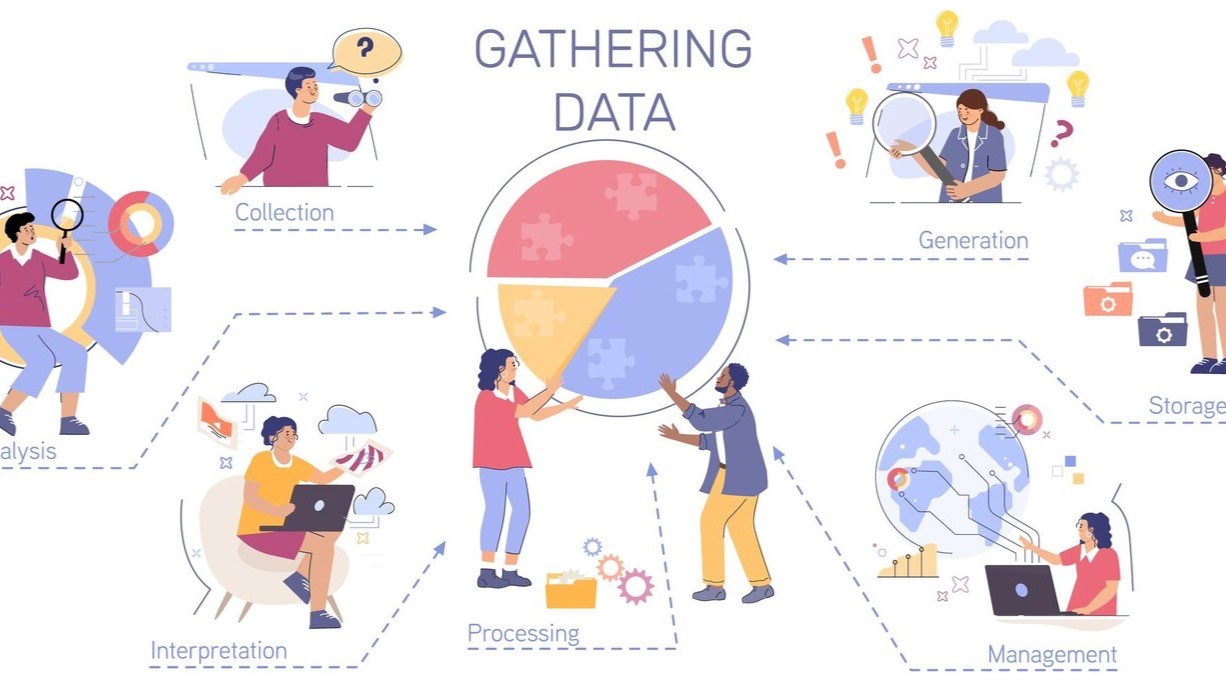
💡 What Are the Six Phases of Data Analysis?
Here’s the secret sauce:
Ask → Prepare → Process → Analyze → Share → Act
Each phase builds on the last, like stacking ingredients on a sandwich—mess one up, and the whole thing flops. But get it right? Chef’s kiss 👨🍳💻
1. Ask: What’s the Problem, Sherlock? 🕵️
Start with the right question—get specific, or you’ll chase your tail.
Example:
- Amazon: “Why are people abandoning their carts?”
- You: “Why do I never stick to my New Year’s resolution past February?”
Pro Tip: Use SMART goals (Specific, Measurable, Achievable, Relevant, Time-bound).
Tools: Old-school notebook or Notion for digital detectives.
🔗 Internal Link idea: Link to a blog on setting SMART goals with data.
2. Prepare: Data, Assemble! 🧩
Now you need your clues. Collect relevant data from all angles.
Example:
Target might explore sales reports, customer feedback, and inventory trends to figure out why pool noodles are a February best-seller.
Tools:
- SQL or Google Sheets
- Evernote for tracking trends (yes, even TikTok rabbit holes)
Pro Tip: Don’t limit yourself—data can be qualitative too!
🖼️ Image Alt Tip: “Preparing data for analysis using spreadsheets and digital tools”
3. Process: Clean Up the Chaos 🧼
Raw data = digital junk drawer. Time to clean house.
Example:
Netflix might sort by viewer habits, regions, and times to make sense of trends.
Tools:
- Python + Pandas (for the nerds)
- OpenRefine
- Google Sheets (because sometimes simple wins)
Pro Tip: Channel your inner Marie Kondo—only keep what brings you insight.
🖼️ Image Alt Tip: “Cleaning and processing data to remove duplicates and errors”
4. Analyze: Connect the Dots 📈
Now for the “Aha!” moments. This is where you dive deep into the cleaned-up data to find patterns, trends, and insights you didn’t see coming.
Example:
Netflix might discover that action flicks dominate Friday night watch sessions for 18–24-year-olds, while rom-coms get all the love on cozy Sunday evenings.
Tools:
- Python or R if you love to crunch numbers
- Tableau or Power BI for visual storytelling magic
Pro Tip: Look for patterns that surprise you—sometimes the real gold shows up where you least expect it.
5. Share: Show & Tell 🎨
Cool insights mean nothing if no one understands them.
Example:
Amazon creates dashboards to show design teams what’s triggering cart abandonment. You? Maybe just a pie chart showing how much you save cooking at home.
Tools:
- Tableau, Google Data Studio
- Canva (for stunning visuals even your mom would love)
Pro Tip: Keep it clean. One bold graph > 10 messy ones.
🖼️ Image Alt Tip: “Visualizing data analysis results with simple, clear charts”
6. Act: Do the Dang Thing ✅
Insights only matter if they drive action.
Example:
Starbucks drops the pumpkin spice in August after spotting early demand.
You? You realize switching grocery stores saves you $50/month.
Tools:
- Trello, Asana to keep your action steps organized
- Habitica if you wanna gamify it all 🎮
Pro Tip: Progress > perfection. Start small, but start.
Real-Life Vibe Check: InnovateCorp Fixes Employee Turnover
Let’s say a fictional company, InnovateCorp, is bleeding talent. Here’s how they apply the six phases of data analysis:
- Ask: Why are employees leaving?
- Prepare: Collect exit interviews + surveys
- Process: Use Python to clean the mess
- Analyze: Spot a trend—new hires who skip leadership training bounce early
- Share: Build a dashboard showing turnover by team
- Act: Launch a mentorship program. Result? 20% improvement in retention.
Boom 💥
Everyday Wins with Data 🎯
Not running a business? Doesn’t matter. This framework slaps in your daily life too.
Scenario: You’re spending too much on delivery food.
Phases:
- Ask: Where’s my cash going?
- Prepare: Check bank statements
- Process: Sort by category
- Analyze: Lattes are eating 50% of your budget (ouch)
- Share: Chart it in Google Sheets
- Act: Make coffee at home = instant savings
🖼️ Image Alt Tip: “Using personal finance data to reduce spending with a six-step process”
✨ Final Takeaways
- The six phases of data analysis are your new best friend: Ask → Prepare → Process → Analyze → Share → Act.
- Use the right tools. Don’t overthink it—Excel, Tableau, and Canva go a long way.
- This isn’t just for business—it’s for life.
Ready to start making smarter moves? Use the six phases of data analysis and level up everything from side hustles to snack habits. 🎯
👇 Want More?
- Check out our beginner’s guide to data visualization
- Read how small biz owners use data daily
- Sign up for our newsletter for more data-driven hacks
#TheSixPhasesOfDataAnalysis #DataDrivenDecisions #DigitalWins #LifeByTheNumbers #DataForAll
check out #LowKeySavageTips
Leave a Reply